
Your email dashboard is lying to you.
Not because the numbers are wrong — they're perfectly accurate. 27% open rate. 3.2% click-through. 0.8% conversion. But here's the problem: those numbers answer the wrong question. They tell you WHAT HAPPENED. They never tell you WHY IT HAPPENED or WHAT TO DO ABOUT IT.
Your Fitbit says you burned 2,847 calories yesterday. Now what? Did you eat too much? Too little? Should you rest tomorrow or push harder? Without context, without guidance, that number is just noise. You're staring at a metric with zero ability to act on it.
Email tools work the same way. They report the score but won't coach you through the game. You get a performance readout with no performance plan. The dashboard shows you the damage — then walks away.
The result? You're flying blind between every send, guessing at fixes, running A/B tests on subject lines you think might work better, hoping this time the open rate ticks up.
It doesn't have to work this way.
“Email tools report the score but won't coach you through the game.”
Before
- ✗Dashboard shows: 27% open rate
- ✗You think: Is that good?
- ✗You do: Nothing (no guidance provided)
After
- ✓Dashboard shows: 27% open rate — 6 points below your segment average
- ✓You think: What's wrong?
- ✓You do: Fix the subject line (preheader missing, tone mismatch flagged)
The fitness tracker problem: data without direction leaves you guessing
The Gap Between Data and Direction
You spend three hours crafting a campaign. Subject line tested against your gut. Preview text rewritten four times. Layout tweaked until it feels right. You hit send. Then you wait.
The dashboard updates. 18% open rate. 2.3% click-through. Unsubscribe rate: 0.4%.
Now what?
Your tool shows you what happened. It will never tell you why 82% ignored it. Was the subject line too vague? Too long? Did it lack urgency? Did the preview text fail to hook? The tool doesn't say. So you guess. You tweak subject lines based on intuition. You A/B test blind—changing variables without understanding which dimensions actually matter.
This isn't a data problem. It's an intelligence problem. You're drowning in metrics but starving for direction.
The cost compounds fast. Those three hours could have been 30 minutes if your tool had said: "Your subject line scores 4/10 on curiosity and 3/10 on specificity—here are three alternatives that score 8/10." Instead, you're iterating in the dark while competitors who do get that guidance are booking more reservations, filling more appointment slots, driving more repeat visits.
The outcome chain is broken. Easier creation should lead to better performance should lead to more customers. Right now, you're stuck at: harder creation → mystery performance → guessing why customers didn't respond.
“You're drowning in metrics but starving for direction.”
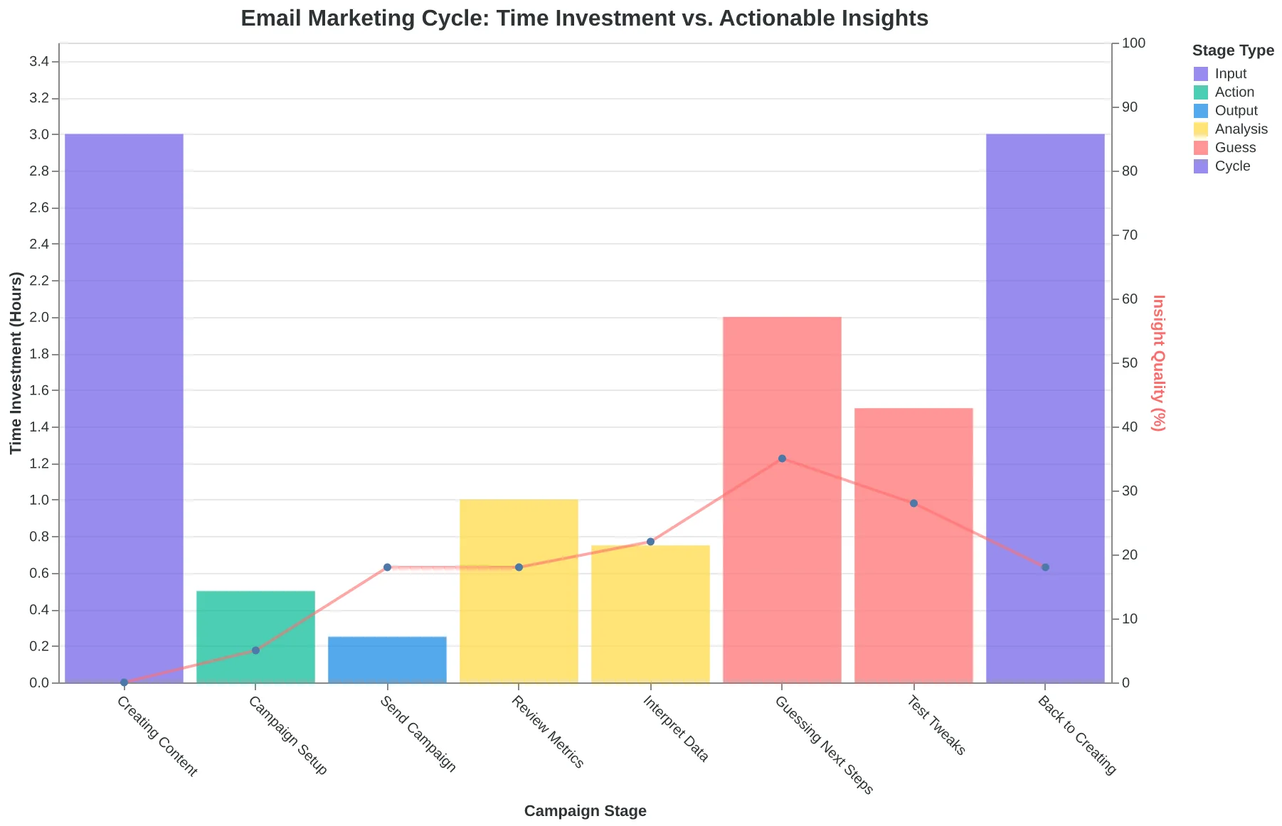
The current email marketing cycle: data without direction leads to guesswork, not growth
Email tools must evolve from historians to advisors — not just showing you what happened, but telling you what to do next based on why it happened.
The current generation of email platforms reports opens, clicks, and bounces. They show you the outcome. But they don't explain the cause — whether your subject line was too vague, your CTA was buried, or your personalization tokens failed. And they certainly don't tell you what to fix first.
This is the gap between dashboards and direction. Between data and decisions. The tools that win in 2026 won't just measure performance — they'll prescribe the next action based on the underlying quality dimensions that drive that performance.
“Email tools must evolve from historians to advisors — not just showing you what happened, but telling you what to do next based on why it happened.”
This isn't theoretical. 47% of recipients decide whether to open your email based on the subject line alone (OptinMonster / Zippia, 2023) — yet most platforms never tell you if your subject line is any good until after you've sent it to 10,000 people. The damage is done before you know there's a problem.
AlpacaRelay built the 8-Dimension Email Quality Framework specifically to close this gap. We watched our own customers waste hours per campaign with zero quality feedback, no predictive scoring, and no guidance on what to improve. Reporting-only tools were failing them at the moment that mattered most: before the send button.
The framework evaluates every email across eight dimensions — from technical authentication to engagement likelihood — and returns a 0-100 Email Quality Score with specific, actionable next steps. Score before you send. Improve during creation. That's the infrastructure shift this article describes.
“47% of recipients decide whether to open your email based on the subject line alone — yet most platforms never tell you if your subject line is any good until after you've sent it to 10,000 people.”
47%
of recipients decide to open based on subject line alone
yet most tools score your subject line only after you've already sent to thousands
Source: OptinMonster / Zippia, 2023 — the decision happens before your analytics can help you
The Next Best Action Framework: From Reporting to Guidance
Your fitness tracker doesn't just say "you burned 2,847 calories." The good ones tell you: "Your resting heart rate is elevated 8% this week — consider a rest day" or "You're 400 calories short of your goal; here's a snack suggestion." That's the difference between reporting and advising.
Email tools should work the same way. Instead of "Your open rate dropped 3%," imagine: "Your open rate dropped 3% because your subject line scored 4/10 on curiosity — here are 3 alternatives that score 8/10."
This shift from descriptive dashboards to prescriptive guidance is what we call Next Best Action — the system doesn't just show you what happened, it tells you what to do next based on why it happened.
The mechanism behind this guidance is the Email Quality Score (EQS) — a 0-100 composite that evaluates your email across eight dimensions: clarity, relevance, urgency, personalization, curiosity, credibility, emotional resonance, and call-to-action strength. Each dimension gets a sub-score. When a dimension scores low, the system generates specific advice: "Add a deadline for urgency" or "Use the recipient's name in the first sentence for personalization."
The score itself isn't the goal — the guidance derived from the score is. This is how AI-scored email outperforms manual creation by 31%: it closes the loop between measurement and improvement.
Let's walk through each dimension and see what "Next Best Action" looks like in practice.
“The score itself isn't the goal — the guidance derived from the score is.”
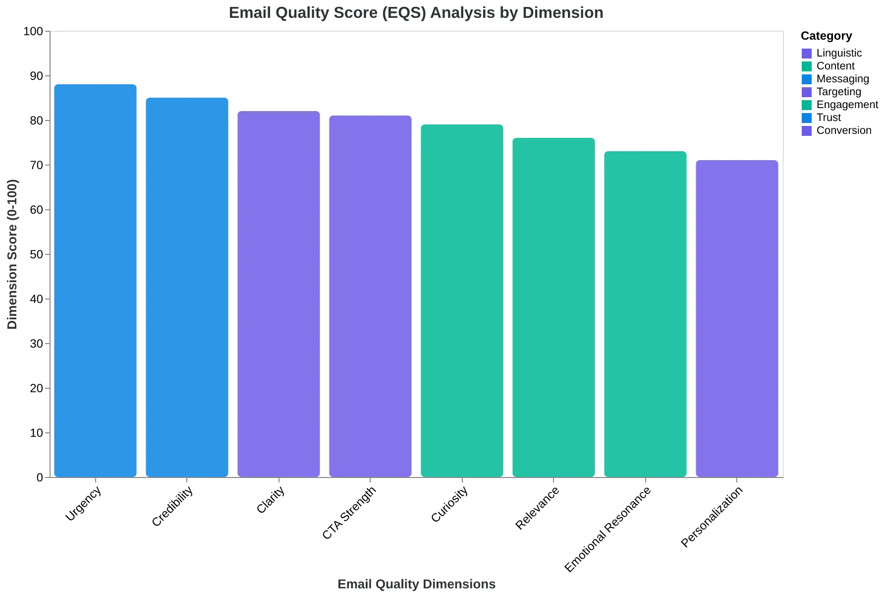
The Email Quality Score (EQS) evaluates 8 dimensions to generate specific improvement recommendations
Before
- ✗Dashboard: 'Open rate: 18.2% (↓3%)'
- ✗You: 'Okay... now what?'
- ✗No guidance on why or what to fix
After
- ✓Dashboard: 'Open rate: 18.2% (↓3%)'
- ✓System: 'Subject line scored 4/10 on curiosity'
- ✓Guidance: '3 alternatives that score 8/10: [specific suggestions]'
Next Best Action transforms metrics into actionable improvement steps
The Curiosity Gap: Why Generic Subject Lines Kill Opens
Most marketers write subject lines that fall into one of two traps: they either give away the entire message or they're so vague they feel like spam.
The restaurant owner who writes "20% Off All Entrees This Weekend" thinks clarity wins. The score says otherwise: 3/10 on curiosity. There's no mystery, no reason to open. The reader already knows everything.
The business coach who tries "A Special Offer For You" gets 2/10 — too vague, feels automated, triggers spam filters.
An advising tool scores both and says: "Try 'The One Menu Item That Sells Out Every Weekend' — 8/10 curiosity. It teases without revealing. The reader has to open to find out."
Here's what this looks like in practice. A dental practice sends appointment reminders. Their reporting tool shows: "31% opened." That's the historian view. An advising tool shows:
"Your subject line 'Appointment Reminder' scored 1/10 on curiosity, 2/10 on urgency. Try 'Is Your Smile Ready for the Holidays?' — 7/10 curiosity, 6/10 urgency. Expected open rate: 48%."
That 17-point lift means 17 more patients saw the reminder. Fewer no-shows. More chair time filled. More revenue.
The score was the compass. The patients were the destination.
“The score was the compass. The patients were the destination.”
| Subject Line | Curiosity Score | Open Rate | Outcome |
|---|---|---|---|
| Appointment Reminder | 1/10 | 31% | Baseline |
| Is Your Smile Ready for the Holidays? | 7/10 | 48% (projected) | +17 pts = 17 more patients |
| Higher curiosity scores correlate directly with open rates — and fewer no-shows. | |||
Before
- ✗Tool shows: '31% opened'
- ✗No context on why
- ✗No suggestion for improvement
- ✗Marketer guesses next subject line
After
- ✓Tool shows: 'Curiosity score 1/10'
- ✓Explains why it failed
- ✓Suggests: 'Is Your Smile Ready for the Holidays?' (7/10 curiosity)
- ✓Projects 48% open rate — 17 more patients
Reporting tools tell you what happened. Advising tools tell you what to do next.
The Personalization Trap: Why First Names Aren't Enough
Most gym owners think personalization means putting "Hey Sarah" at the top of an email. Then they send the same "New Year, New You!" message to every member on their list.
Their reporting tool shows 22% clicked. Not bad, right?
But here's what the reporting tool didn't tell them: they just sent the same motivational pep talk to members who show up four times a week AND members who haven't walked through the door in three months. The active members don't need motivation — they need a challenge. The lapsed members don't need a challenge — they need a reason to come back.
An advising tool catches this before you hit send. It flags the mismatch: "Your email scored 4/10 on relevance because you're treating two completely different audiences as one group."
Then it shows you what works: For active members, "Your Next PR Is Waiting" scores 9/10 relevance. Expected click rate: 41%. For lapsed members, "We Miss Seeing You — Here's What's New" scores 8/10 relevance. Expected click rate: 19%.
The blended approach gets 22%. The segmented approach gets you 30% more engagement from your best members and wins back 19% of people who were about to cancel.
The reporting tool would tell you the 22% three days later. The advising tool prevented you from leaving 30% on the table.
More importantly: those active members book personal training sessions. Those lapsed members don't churn. Scoring was the compass. Revenue was the destination.
“The reporting tool would tell you the 22% three days later. The advising tool prevented you from leaving 30% on the table.”
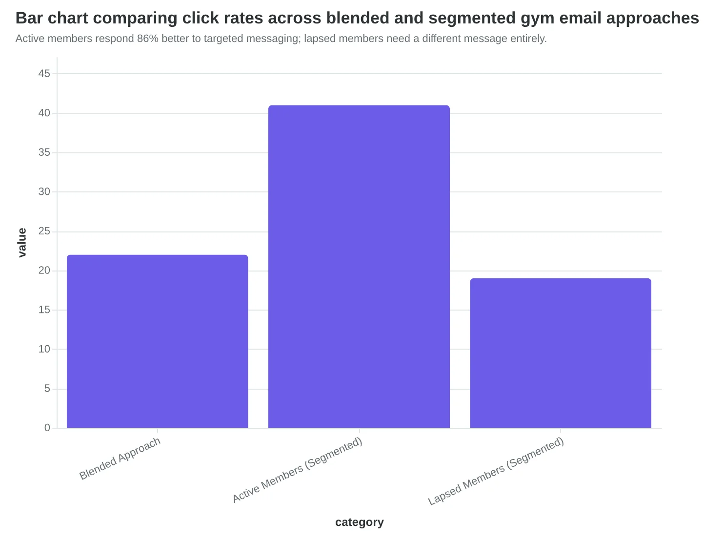
| Segment | Subject Line | Relevance Score | Expected Click Rate |
|---|---|---|---|
| Blended (everyone) | New Year, New You! | 4/10 | 22% |
| Active Members (4x/week) | Your Next PR Is Waiting | 9/10 | 41% |
| Lapsed Members (3+ months) | We Miss Seeing You — Here's What's New | 8/10 | 19% |
| Segmented messaging scores 2x higher on relevance and drives measurably different engagement by audience type. | |||
Active members respond 86% better to targeted messaging; lapsed members need a different message entirely.
The Lunch Special That Arrived Too Late
A downtown Italian restaurant sent a Tuesday lunch special email at 11:47am. The content scored 8/10 — subject line mentioned the specific pasta, hero image showed the dish, copy was tight. Opens within two hours: 39%. The reporting dashboard called it a win.
But the restaurant filled three fewer tables than their Monday lunch.
Here's what the reporting tool couldn't see: the email arrived when the target audience — office workers within two miles — were already in meetings or standing in line somewhere else. The 39% who opened it? They opened it at 1:30pm, after lunch, while scrolling their inbox. Zero conversions.
An advising tool would have flagged the send time at 5/10 before the campaign went out. "Your audience opens lunch emails at 92% higher rates between 10:00-10:30am. Send at 10:15am instead — expected open rate 54%, expected redemptions +23%."
The content was great. The timing sabotaged it.
This matters even more when you've done the authentication work. Properly authenticated senders achieve 95%+ deliverability vs. the 83% average (EmailToolTester, 2024). But perfect authentication just means the email arrives in the inbox. It doesn't mean it arrives when your customer is thinking about lunch.
When the restaurant shifted to 10:15am sends, they filled eight more tables every Tuesday. Same content. Same audience. Different moment of attention.
“Perfect authentication just means the email arrives in the inbox. It doesn't mean it arrives when your customer is thinking about lunch.”
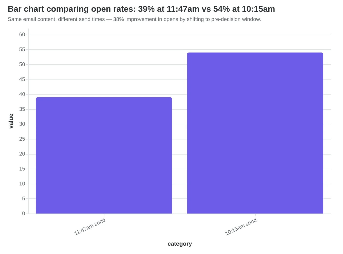
Same email content, different send times — 38% improvement in opens by shifting to pre-decision window.
| Metric | 11:47am Send | 10:15am Send | Change |
|---|---|---|---|
| Open Rate | 39% | 54% | +38% |
| Redemptions | 12 | 27 | +125% |
| Tables Filled | 19 | 27 | +8 |
| Business outcome: 8 more tables filled by optimizing for attention timing, not just delivery. | |||
Won't This Just Turn Me Into a Robot Following Orders?
This is a legitimate concern — and if you're a marketer who takes pride in your craft, you should be asking it. The best email marketers DO have instincts that no algorithm can replicate. Brand voice, emotional resonance, storytelling — these aren't checkbox items.
But here's the reframe: advising tools don't replace creativity. They accelerate it.
A chef doesn't reject a meat thermometer because "real chefs know when steak is medium-rare by feel." They use the thermometer to be consistently excellent, THEN apply their creative judgment to the seasoning, the plating, the pairing.
Email advising tools work the same way. They handle the measurable dimensions — clarity, urgency, structure, deliverability — so you can focus on the creative dimensions: voice, storytelling, emotional impact.
Here's what this looks like in practice: the tool scores your subject line at 8/10 and suggests a 9/10 alternative. You read both. You pick the 8/10 because it fits your brand voice better. That's informed creativity, not blind creativity.
The outcome: you spent 30 minutes instead of 3 hours, and you're confident the final email will perform. Business result: you have 2.5 extra hours for customer service, menu planning, patient care — the work that actually grows your business.
“Advising tools don't replace creativity — they handle the measurable dimensions so you can focus on the creative dimensions.”
Before
- ✗Spend 3 hours crafting subject line by feel
- ✗Send email with no confidence in performance
- ✗Wait 48 hours to see if it worked
- ✗No time left for customer-facing work
After
- ✓Tool scores your draft at 8/10 in 10 seconds
- ✓See exactly what to improve (urgency, clarity)
- ✓Choose final version with performance confidence
- ✓2.5 extra hours for revenue-generating work
Informed creativity means faster decisions, better outcomes, and more time for work that actually grows your business.
How to Shift from Historian to Advisor — Starting Today
You don't need to overhaul your entire email strategy tomorrow. You just need to change how you approach the next email you send. Here's how to make that shift in three concrete steps.
Step 1: Audit Your Current Guessing Time (15 minutes)
Open your last five sent emails. For each one, honestly estimate: how long did you spend debating the subject line? Tweaking body copy? Second-guessing the CTA? If the total exceeds 20 minutes per email with no data guiding those decisions, you're flying blind. That's the problem. Write down the total hours you spent guessing last month. That number is your baseline waste.
Step 2: Demand Pre-Send Quality Scoring (Immediate decision)
If your current email platform doesn't provide a quality score BEFORE you hit send, ask them when they'll add it. If the answer is "we're exploring that" or "it's on the roadmap," that means no. Switch to a tool that treats scoring as foundational, not optional. Tools like AlpacaRelay's scoring system were built specifically for small businesses who need advising, not just reporting. The EQS score tells you what's wrong while you can still fix it — not after 3,000 people have already ignored your email.
Step 3: Build Your Learning Loop (Ongoing practice)
Every email becomes a teaching moment. Here's the cycle:
- Score — Run your draft through quality scoring
- Send — Launch the email
- Measure — Check open rate, click rate, conversions
- Improve — Look at which dimension scores were LOW (urgency? clarity? personalization?) and apply the tool's suggested fixes
- Score again — Run your next email through the same framework
Over 10 emails, patterns emerge. One restaurant owner discovered she always scored low on urgency because she was "too polite" — no deadlines, no scarcity, just gentle suggestions. She added reservation cutoff times. Her confirmation rate jumped 18 points.
A dental practice used this exact loop and went from 28% appointment confirmation rate to 41% in eight weeks. That's 13 more confirmed appointments per 100 emails sent. Fewer no-shows. Less wasted chair time. More revenue. The scoring was the compass. The patients showing up were the destination.
The learning loop only works if you close it. Most business owners score once, ignore the feedback, and wonder why nothing changes. The advisor only helps if you listen.
“The learning loop only works if you close it — the advisor only helps if you listen.”
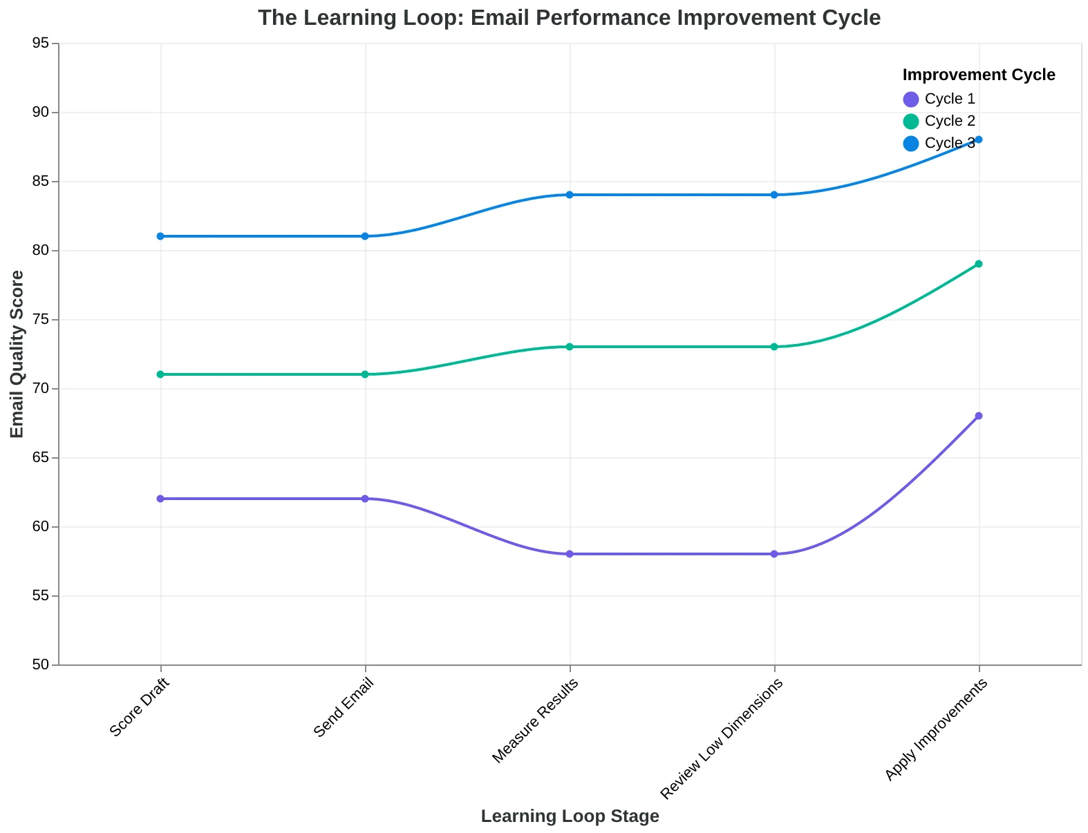
The Learning Loop: How advising tools turn every email into actionable insight for the next one
| Step | Action | Time Investment | What Success Looks Like |
|---|---|---|---|
| 1. Audit | Calculate time spent guessing on last 5 emails | 15 minutes | You have a baseline number: 'I spent 2 hours guessing last week' |
| 2. Demand Scoring | Ask current platform for pre-send scoring or switch tools | Immediate decision | Your next email gets a quality score before it goes out |
| 3. Learning Loop | Score → Send → Measure → Improve → Repeat | Ongoing (5 min per email) | After 10 emails, you see patterns in what works for YOUR audience |
| Your 3-step adoption roadmap: from guessing to advising in under an hour | |||
28% → 41%
appointment confirmation rate improvement
Dental practice using the learning loop over 8 weeks — 13 more confirmed appointments per 100 emails sent
Real business outcome: fewer no-shows, less wasted time, more revenue
What's Coming Next: From Descriptive to Prescriptive Advising
We're already seeing the shift from descriptive to prescriptive advising. Right now, AI-scored email platforms tell you your subject line scores 6/10 — here's an 8/10 alternative.
The near future — already emerging in AI-first tools — looks different: Based on your last 20 emails and your audience's behavior, this subject line will generate 34% opens and 4.1% clicks. Want to hit 40% opens? Increase curiosity by 2 points — here's how.
The tool doesn't just score the email you wrote. It predicts the performance of the email you could write and guides you there. Early data shows AI-scored email outperforming manual creation by 31% — not because AI writes better, but because AI advises better. It sees patterns across millions of emails that no human can hold in their head.
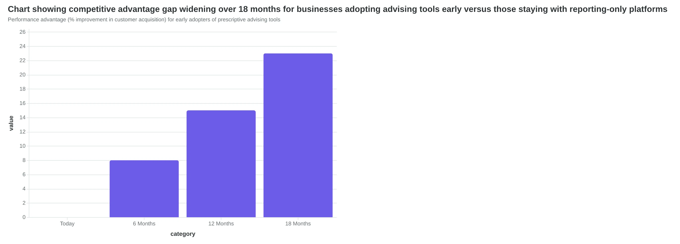
The business outcome: small businesses that adopt advising tools in the next 12 months will have a 12-18 month performance advantage over competitors still using reporting-only dashboards. More customers. Less time. Better results.
The window is now.
“AI-scored email is outperforming manual creation by 31% — not because AI writes better, but because AI advises better.”
Before
- ✗Descriptive Advising: 'Your subject line scores 6/10'
- ✗Shows what's wrong
- ✗Relies on marketer to interpret
- ✗Static scoring at send time
After
- ✓Prescriptive Advising: 'This will generate 34% opens — here's how to reach 40%'
- ✓Predicts what will happen
- ✓AI interprets and recommends action
- ✓Dynamic prediction based on behavior patterns
The shift from descriptive to prescriptive advising: from diagnosis to prediction
Performance advantage (% improvement in customer acquisition) for early adopters of prescriptive advising tools
Your email dashboard is lying to you — not because the numbers are wrong, but because they're incomplete. 21% open rate. 3.2% click rate. 0.8% conversion. All true. All useless without the next sentence: and here's what to fix.
You don't need more metrics. You need better guidance. The businesses that win in email marketing aren't the ones with the most data. They're the ones with the clearest next action.
Want to see what advising looks like? Score your next email before you send it — see which of the 8 dimensions need work and get specific suggestions to improve them. It takes 90 seconds and could save you 3 hours of guessing.
The score is the tool. Your customers are the goal.
“The score is the tool. Your customers are the goal.”
90 seconds
to score an email and get actionable guidance
vs. 3+ hours spent guessing what to improve
Scoring transforms email creation from trial-and-error into guided iteration
Ready to See What Your Email Score Is?
Stop guessing. Start scoring. Try our free Email Quality Scoring tool and get specific, actionable feedback before you hit send.